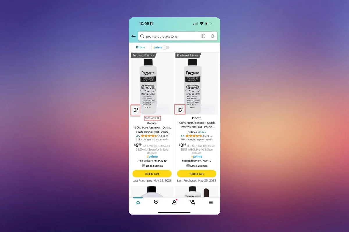
Amazon has rolled out a new feature that alters the display of products on its mobile app. A "+" sign now appears in the left corner of the main image on product listings. When clicked, it reveals 14 items similar to the one viewed. This applies to both advertised and non-advertised listings.
The introduction of this feature emphasizes the need for a compelling main image. Market share could be lost if the main image fails to attract shoppers.
There's uncertainty about whether this feature includes paid product placements. However, if a product appears on a competitor’s listing, an attractive main image could potentially divert clicks and sales to your product.
This A/B testing is an opportunity for both defence and conquest strategies. It's advisable to optimize your listings for more traffic, always within Amazon’s Terms of Service.
Note: The text is authored by Noemi Bolojan, co-founder of Scale Wave, a company specializing in using data to help 6 and 7-figure brands increase their sales on Amazon.
