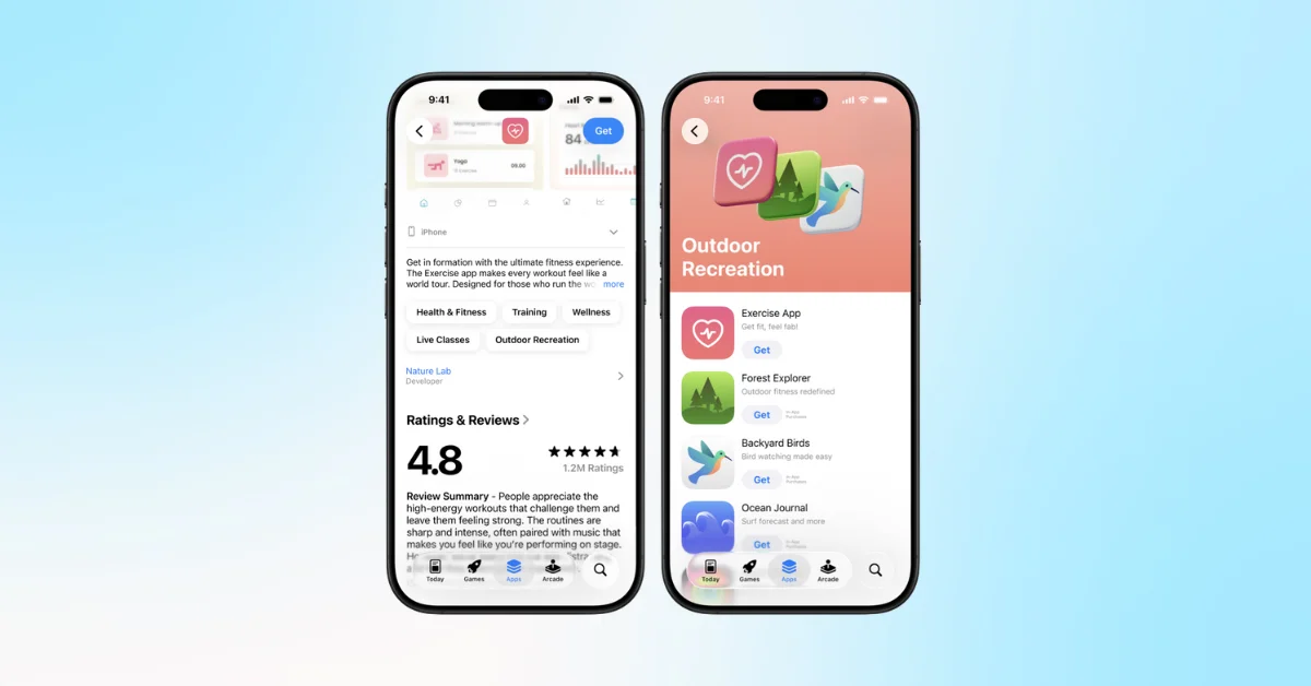
Apple has rolled out a significant update to the Search tab in its App Store, reorganizing how content is presented to users.
The update includes the following modifications:
Removal of Discover Section: The Discover section, which previously displayed a list of popular search terms and keywords at the top of the Search tab, has been removed.
Prominence of Suggested Apps: Immediately below the search bar, users now see a section of suggested apps. This section has always included an ad in the first position, but it's now more prominently placed at the top of the Search tab.
Expandable Suggestions: Users can expand the suggested apps section to view more recommendations.
Direct Category Access: Below the suggested apps, users can now browse app categories directly from the Search tab.
Top Charts: While no longer on the main Search tab, top charts and full category listings are still available in the Browse section.
Potential Impact on Ad Visibility
The repositioning of the suggested apps section, including its leading advertisement, to the top of the Search tab may affect its visibility to users. Generally, items placed at the top of a page tend to receive more attention from users. This principle, known as the "above the fold" concept in web design, suggests that content positioned higher on a page often gets more views and interactions.
However, the actual impact on click-through rates (CTR) for these ads can vary based on numerous factors, including user behavior, the relevance of the suggested apps, and individual user preferences. Concrete data on CTR changes would require analysis of user interaction patterns following this update.
Apple has not provided official commentary on the reasons behind these changes or any expected outcomes from the new layout.

