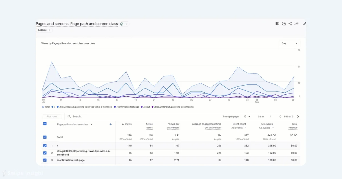
Google Analytics 4 (GA4) is gradually rolling out a new feature that enhances the visualization capabilities of its detailed reports. This update allows users to plot specific rows from data tables directly onto line charts, providing a more customizable and focused view of data trends over time.
Key Features of the Update:
- Users can now include or exclude dimensions in line charts within detailed reports.
- The feature allows plotting of the total row and up to five individual table rows.
- This addition enables easier measurement of changes over time for selected metrics.
How to Use the New Feature:
- Navigate to a detail report in Google Analytics 4.
- In the data table, select the total row and/or up to 5 specific rows.
- Click the "Plot rows" option at the top of the table.

This update significantly enhances the ability to visualize and compare specific data points within GA4 reports. By allowing users to plot selected rows, it becomes easier to focus on key metrics and their trends over time.
It's important to note that this feature is being rolled out gradually. Some users may already have access, while others might see it appear in their GA4 accounts in the coming days or weeks.
This addition to GA4 represents Google's ongoing efforts to improve data visualization and analysis capabilities within the platform, providing users with more flexible and powerful tools for understanding their analytics data.
