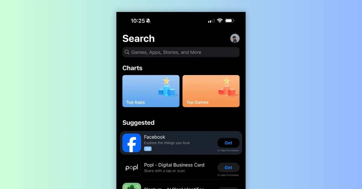
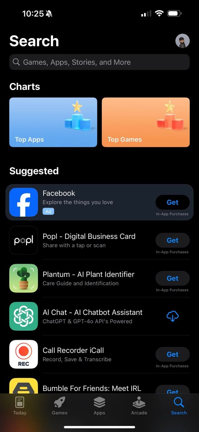
Apple has introduced a new UI change in the search tab of the App Store, displaying header images for the top charts. Here are the key points:
Key Insights
Replacement of Search Query Suggestions:
- The new UI replaces a small batch of search query suggestions.
- This change suggests that users were not engaging with those suggestions, likely due to the high friction of the search tab.
Benefits of Adding Top Charts:
- Visual Appeal: The use of header images is more visually appealing.
- Developer Attention: It brings attention back to top charts, which have been considered a vanity metric by Apple.
Implications for ASO Practitioners
- Data Over Opinions: Trust in data rather than opinions when assessing the impact of this change.
- Browse Impressions and Downloads: If your app is already high in the top charts, you may see an increase in impressions and downloads due to reduced friction in the search bar.
