Microsoft Clarity has introduced Attention Maps, a feature designed to enhance understanding of user behavior on websites. This tool visualizes where users spend the most time on a webpage, using color gradients to indicate areas of high and low engagement. Attention Maps highlight user interaction, allowing website owners to determine if visitors engage with key elements and whether critical CTAs or information are being overlooked. This insight aids in making data-driven decisions regarding content placement and page layout.
Key Features of Attention Maps
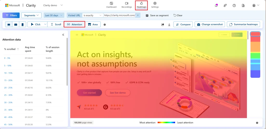
Attention Maps offer several metrics to analyze user engagement:
- Average Time Spent: Displays the time users spend on specific sections.
- Percentage of Session Length: Shows how long users focus on a section compared to the overall session.
- Heatmap Visualization: Uses warmer colors for areas with more time spent and cooler colors for less engagement.
How to Use Attention Maps
- Install the Clarity Tracking Code: Ensure the tracking code is on the desired pages.
- Access Attention Maps: Go to the Heatmaps section in the Clarity dashboard to explore metrics like:
- % Scrolled
- Avg Time Spent
- % of Session Length
- Analyze and Optimize: Focus on cooler areas for improvement and test layout changes to enhance visibility of important elements.
Attention Maps are beneficial for various applications, including optimizing e-commerce pages, refining blog layouts, and improving form submissions. They provide actionable insights to enhance usability, boost conversions, and drive better business outcomes.
Attention Maps are part of Clarity’s Heatmap suite, which includes Click Maps and Scroll Maps, offering a comprehensive view of user interactions to create engaging experiences.


