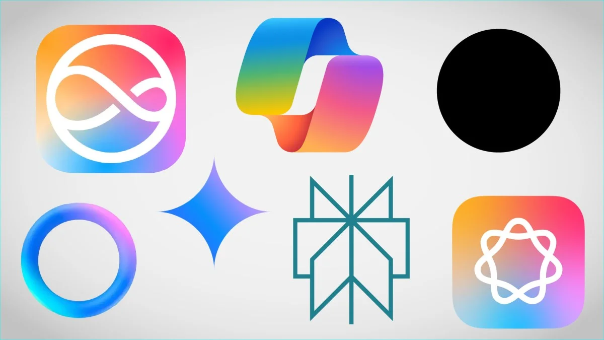
Apple has joined the competition to create an AI icon that effectively communicates the concept of artificial intelligence to users. The new icon, representing "Apple Intelligence," is a circular shape made up of seven loops, or possibly a circle with a lopsided infinity symbol inside. This ambiguity highlights the broader challenge: no one knows what AI should look like, yet it needs to be represented in user interfaces to indicate machine learning models.
Evolution of AI Icons
Early AI icons were often robots, wizard hats, or magic wands, which suggested inhumanity, rigidity, or irrational invention. These were not suitable for conveying the reliable, factual nature of modern AI. Current trends lean towards non-threatening, abstract, and simple designs that avoid anthropomorphism.
Corporate Design Influences
Corporate logo design is influenced by a mix of strong vision, commercial necessity, and compromise-by-committee. For example:
- OpenAI uses a black dot, symbolizing a featureless hole for queries.
- Microsoft's Copilot logo is complex and indescribable.
- Google and Perplexity use icons with sharp edges but friendly shapes.
Color and Shape Trends
Most AI icons use pleasant, candy colors like pink, purple, and turquoise, which are cheery and approachable. These colors create a friendly and open impression rather than emphasizing expertise or efficiency. Some icons also animate, adding a sense of life and responsiveness.
Challenges in Icon Design
Creating an icon that unambiguously represents AI is challenging. Unlike email or settings icons, which have clear, universally understood symbols, AI lacks a straightforward visual representation. Companies are cautious about defining AI too narrowly, as they want to maintain the fiction that AI can theoretically do anything.
Consumer Perception
Consumers often ignore technical names and prefer simpler terms like "ChatGPT" over version numbers. They may not connect with names like "Bard" but accept "Gemini" after focus testing. Apple's approach involves multiple logos and swirling colors to indicate AI activity, reflecting the current state of vague and abstract AI representations.
Conclusion
Until AI is better defined, icons and logos will likely remain abstract, colorful, and non-threatening. These designs aim to be friendly and approachable, avoiding any suggestion that AI could be a threat to jobs or other aspects of life.
