Data Visualization News

Browse Data Visualization updates sorted by latest

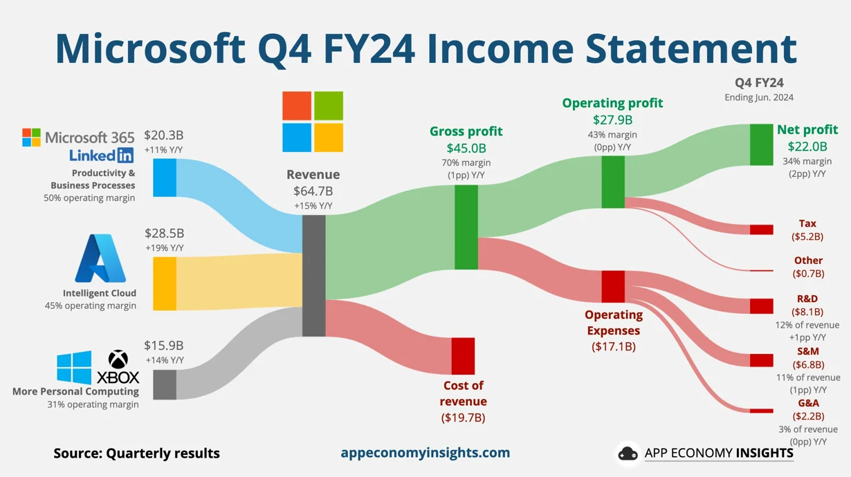
Microsoft Misses Q2 Expectations Despite 15% Increase in Revenue

Microsoft Misses Q2 Expectations Despite 15% Increase in Revenue

5 months ago

Microsoft’s cloud and AI services division fell below analysts’ expectations despite reporting $64.7 billion in Q2 revenue, a 15% year-over-year increase. Shares dropped over 3% post-trading. Azure's 29% growth lagged market predictions. Nvidia benefits from generative AI models like ChatGPT. Microsoft invested billions in OpenAI and over $15 billion in AI globally. The personal computer division saw a 14% revenue rise, while device sales fell.
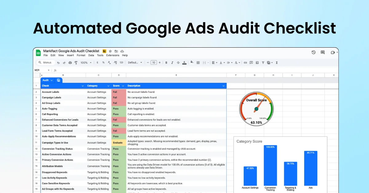
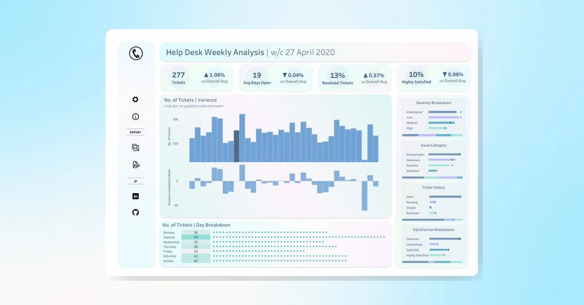
Tableau Inspiration: Track Help Desk Performance

Tableau Inspiration: Track Help Desk Performance

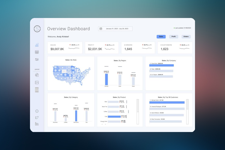
John Power's business dashboard visualizes weekly help desk performance, including tickets received, average days open, cases resolved, and status. Explore the visualization on Tableau Public.

Tableau
Tableau

Official Source

Official Source

Tableau is a Official Source. The source has been verified by Swipe Insight team.

Official Source
New Data Visualizations and Tips in Latest Tableau Community DataFam Roundup

New Data Visualizations and Tips in Latest Tableau Community DataFam Roundup

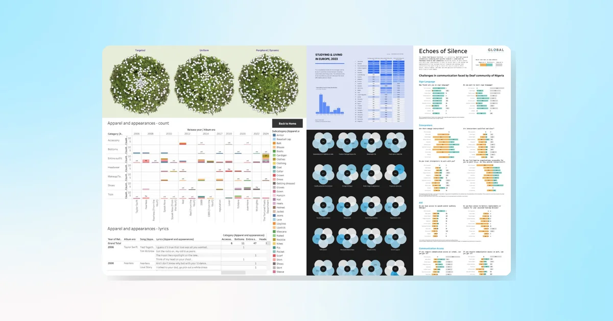
Now featuring new data visualizations, tips, and ways to engage, the latest DataFam Roundup highlights the Tableau Community. This week's focus is on Joy Victor, a data analyst from Nigeria, who shares her journey and contributions to the community. The roundup also includes various community projects, upcoming events, and inspirational visualizations by members. Join the AI + Tableau User Group's inaugural meeting on June 3.

Tableau
Tableau

Official Source

Official Source

Tableau is a Official Source. The source has been verified by Swipe Insight team.

Official Source
ChatGPT Introduces Advanced Data Analysis Features and Google Drive Integration Trending ️‍🔥

ChatGPT Introduces Advanced Data Analysis Features and Google Drive Integration

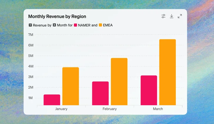
New ChatGPT upgrades offer advanced data analysis features. Users can now upload files directly from Google Drive and Microsoft OneDrive, interact with tables and charts, and customize and download charts for presentations. The enhancements, available soon for ChatGPT Plus, Team, and Enterprise users, simplify data analysis tasks and save time. Real-time table interaction, chart customization, and robust security and privacy are also part of the update.

OpenAI
OpenAI

Official Source

Official Source

OpenAI is a Official Source. The source has been verified by Swipe Insight team.

Official Source
Tired of spending too much time creating audits for your clients?

Tired of spending too much time creating audits for your clients?

Featured

Marketing Auditor simplifies your audit process, letting you generate comprehensive, white-label reports in just a few clicks. Save over 10 hours per report while analyzing 200+ data points and delivering 50+ pages of actionable insights. Customize reports with professional themes or your own branding, and export them in editable formats like PowerPoint or Google Slides to showcase your expertise.

Learn Cool Tableau Techniques with Ken and Kevin Flerlage at Tableau Conference

Learn Cool Tableau Techniques with Ken and Kevin Flerlage at Tableau Conference

Stream the popular session from Tableau Conference #Data24, featuring Ken Flerlage and Kevin Flerlage, now available on YouTube. The session focuses on how to perform exciting tasks in Tableau.

Tableau
Tableau

Official Source

Official Source

Tableau is a Official Source. The source has been verified by Swipe Insight team.

Official Source
Daft Punk and Looker Studio's Dynamic Tron Bike Sliders for Fun

Daft Punk and Looker Studio's Dynamic Tron Bike Sliders for Fun

8 months ago

Looker Studio has created an interactive report using Tron bikes and Daft Punk sliders, allowing users to manipulate the position of images based on dynamic data. The report, created for fun and infographics, uses lines for perspective grids, parameters and sliders to move the bikes, bar charts for bike light trails, table charts for dynamic bike positions, and pictures. Users are invited to interact with the bikes within the Looker Studio report.

5 SEO Reports in Google Analytics 4 (how to build them)

5 SEO Reports in Google Analytics 4 (how to build them)

10 months ago

The article provides a guide on creating five SEO reports in Google Analytics 4 for effective SEO optimization. These reports focus on organic search landing pages, devices used for organic search, preferred search engines, Google Search Console Reports, and user behavior flow. The tutorial also highlights the benefits of integrating Google Search Console with GA4.

Double Your Tableau Dashboard Quality with These Steps Today

Double Your Tableau Dashboard Quality with These Steps Today

10 months ago

To enhance the quality of Tableau dashboards, follow these steps: search Tableau Public, download workbooks to understand their structure, open the workbook, connect to your data, swap out the data source, adjust the formatting, publish to your Tableau Server or Tableau Cloud, and share with stakeholders. This process can potentially double your productivity. Guidance is provided for swapping out data using a dashboard by Priya Padham as an example.

You want to improve your dashboard designs?

You want to improve your dashboard designs?

10 months ago

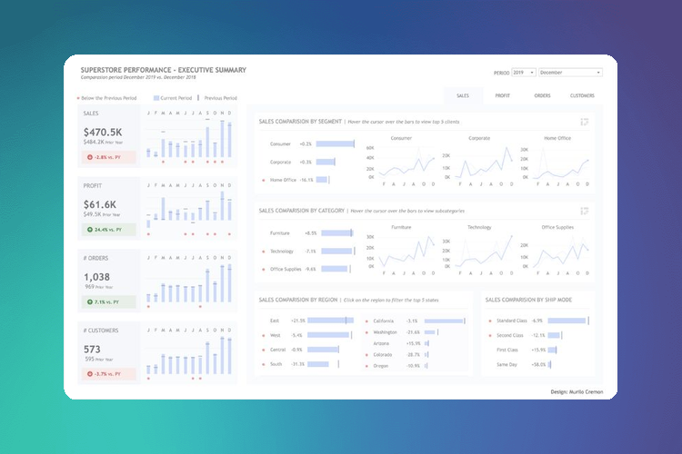
To enhance dashboard designs, seven key skills are recommended: utilizing simple charts, maintaining color consistency, understanding user needs, seeking feedback for iterations, providing ample layout space, prioritizing the display of crucial metrics, and incorporating interactivity for increased engagement. The design advice is provided by Murilo Cremon.

FAQs