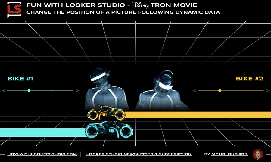
Looker Studio has created an interactive report using Tron bikes and Daft Punk sliders, allowing users to manipulate the position of images based on dynamic data. The report, created for fun and infographics, uses lines for perspective grids, parameters and sliders to move the bikes, bar charts for bike light trails, table charts for dynamic bike positions, and pictures. Users are invited to interact with the bikes within the Looker Studio report.
The article discusses a custom chart created using Looker Studio and Piwik Pro's graphical charter. The author used a simple data set and various components like bar charts, dropdown controls, parameters, images, and calculated fields to design a perspective effect that dynamically compares two months of data from Piwik Pro's demo account. The author plans to enhance this visualization in the future and experiment with more optical illusions. The shared report can be accessed in Looker Studio.
The tutorial guides on adding Google Analytics 4 (GA4) conversion rates and event metrics into Looker Studio. It provides a workaround for Looker Studio's limitation of not mixing aggregated and non-aggregated fields. The process involves creating a table chart with session-scoped dimension, basic and recalculated metrics, and event counts. It also covers data blending and using chart calculated fields.
Run a Meta Ads audit with 100+ data points using a structured, automated checklist. Review campaigns, ad sets, ads, creatives, targeting, budgets, and delivery settings to spot hidden issues and missed optimizations. Built for agencies and teams managing multiple accounts who want consistent audits, faster reviews, and clear, actionable insights—without manual digging.
The tutorial demonstrates how to create a horizontal menu bar in Looker Studio using a treemap chart. The method involves drawing a treemap with equal areas for each menu item, by assigning a static metric value of 1 for all dimension values. The small height of the treemap ensures all areas appear on the same line, forming a horizontal menu. Alternatives like a vertical menu bar and a graphical version using emojis are also suggested.
The article offers a method to replicate the UNION ALL operator in Looker Studio for merging data sets with identical schema. It involves creating individual data sources, blending them ensuring no row matches with others, and using the COALESCE function to join similar fields across tables. The result is a custom UNION operator that combines all data.
Looker Studio has introduced a data blending engine with join types and a new user interface. This allows for chart creation from multiple data sources, enhancing data manipulation possibilities. The interface provides academic, streamlined, and visual access. The feature also enables calculated fields creation on each table and data reaggregation.
The article provides a guide on how to use a calculated field in Looker Studio (formerly Google Data Studio) to return the oldest date from a date dimension. The process involves using the MIN function to get the oldest date and then using the PARSE_DATE function to convert the numeric output into a date. The input for this process is any date type dimension, and the output is the oldest date.
This tutorial explains creating an interactive Looker Studio report to compare BigQuery data across custom date ranges. It details setting up a BigQuery data source, implementing comparison options (previous year, same days, preceding period, custom period), and configuring controls and charts for dynamic comparison. The solution, refined over two years, addresses a common demand in Looker Studio, enhancing data comparison functionality.
This article guides on implementing a weighted sort in Looker Studio for rates like Search Console CTR. It explains using a data set, blended data, and calculated fields for sorting rates by significance, not just value. Inspired by analytics experts, it aims to prioritize rates by actual impact, avoiding misleading percentages from low-volume data.