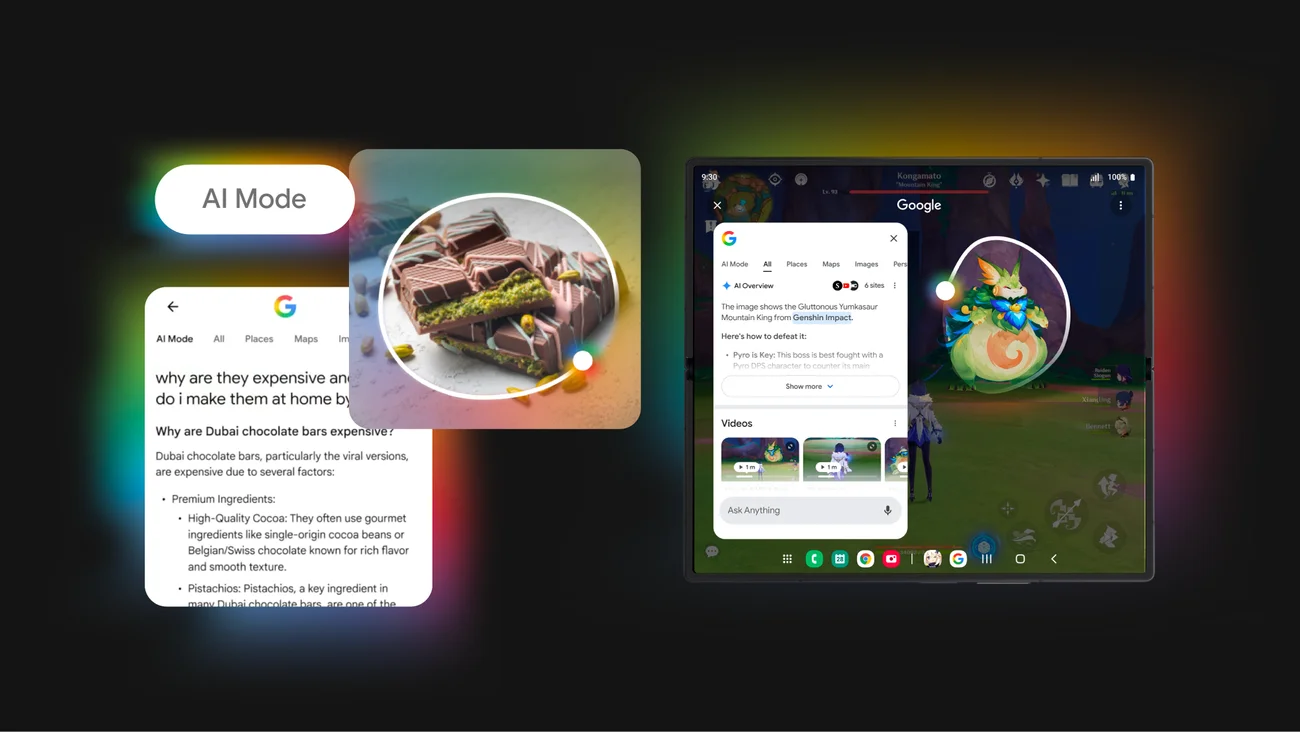
Google has launched a new layout for Google AI Overviews with several key changes:
Key Changes
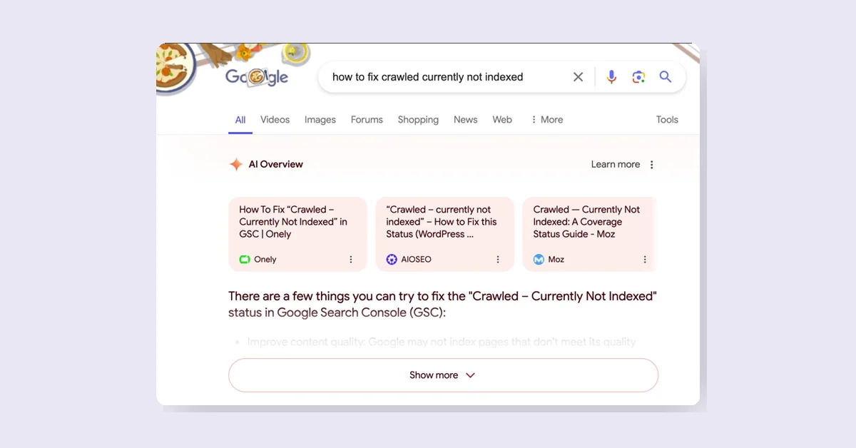
- Links to Websites: These are now positioned at the top of the page, enhancing their visibility and increasing the likelihood of being clicked by searchers.
- New Structure: The AI Overview responses have been restructured.
- Different Coverage: There is varied coverage per the verticals being tracked.

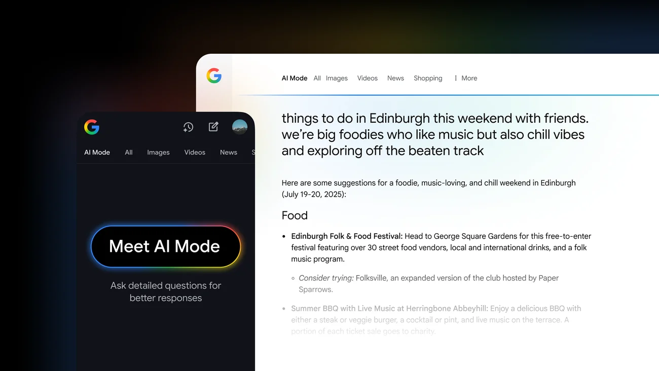
New Layout
Previous Layout
- Link cards were previously placed below the AI Overview answer, making them less visible and harder to click.
- By default, link cards were hidden and required clicking "Show more" to view them, as seen in the screenshot below.
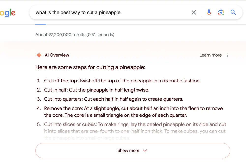
Previous Layout
