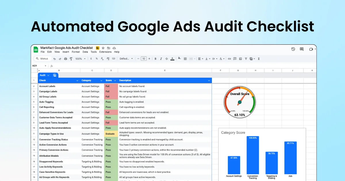
BigQuery has introduced resource utilization charts in Preview, allowing users to track past resource usage, plan for future needs, and troubleshoot performance. These charts aggregate metrics by querying specific INFORMATION_SCHEMA views: INFORMATION_SCHEMA.JOBS, INFORMATION_SCHEMA.JOBS_TIMELINE, and INFORMATION_SCHEMA.RESERVATION_CHANGES, with real-time updates available for a maximum of 30 days.
Chart Features
The resource utilization view includes an event timeline chart that displays data over a maximum of 30 days, with a default view of 1 hour. Users can visualize metrics such as slot usage and bytes processed over time, with detailed legends for clarity.
The configuration pane allows users to select predefined views or customize metrics. Key elements of the charts include:
- Status chips that provide additional information about metrics, indicating loading status, data freshness, or loading failures.
Viewing and Configuring Charts
To view and configure the resource utilization charts, follow these steps:
- Access the Google Cloud console and navigate to the BigQuery Monitoring page.
- Select the relevant project based on your role (administrator or data analyst).
- In the Resource utilization tab, view a summary of resource usage by location.
- Choose a time period for metrics (e.g., 1 day) and toggle to view real-time metrics if desired.
- In the Chart configuration pane, configure the following fields:
- Metric view: Select a predefined view.
- Metrics: Choose or edit a metric.
- Group by: Determine how to group the data.
- Filters: Set filters for the data.
- Click Apply to save changes.
BigQuery offers pre-configured views of resource utilization metrics, allowing users to easily access and analyze their data.